

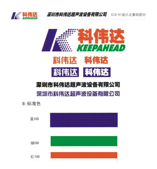
I. LOGO Composition:
The logo consists of three parts: a graphic element, Chinese characters, and English letters. The graphic element  is derived from the initial letter K of “Keepahead” (the pinyin of the company’s name), symbolizing both the continuous forward propagation of ultrasonic energy and the corporate spirit of Keweida employees—one of continuous innovation, forging ahead courageously, and striving for progress. The Chinese characters “麻豆成人电影” signify the company’s grand and far-reaching aspirations, as well as its unwavering belief in unity across all levels to achieve common goals; The English phrase “KEEPAHEAD” means “Stay ahead,” embodying the company’s business philosophy of consistently pursuing excellence and leading the way in the industry.
II. LOGO Basic Colors: Blue, Green and Red
Blue: Water, Blue Sky, Sunshine
Green: Represents environmental protection. Everything thrives under water, blue sky and sunshine.
Red: Represents that everything blossoms and bears fruitful fruits in a fresh and environmentally friendly environment and in the light of water, blue sky and sunshine.
III. Overview
LOGO overall design strives to highlight the industry characteristics of ultrasonic technology, Keweida always maintain the business philosophy of the industry, and give people a strong visual effect.






 0755-28833313 0755-28070333 0755-28070666